The Anatomy of a Change Management Dashboard: Cutting Through the Illusion
Change dashboards must tell the truth, support decisions, and reflect the human reality of change, not just make things look tidy. This article serves up the special brew for building a change management dashboard that gives executives the clarity they need to lead with confidence.

Most change dashboards I’ve seen are an illusion. They look slick in executive forums but add very little actual value.
Here’s the dirty secret: most change management dashboards aren’t built to inform. They’re built to comfort. They give executives a soothing illusion of control; green lights, neat charts, tidy timelines, while the real, messy human story of adoption, resistance, and commitment plays out in the shadows.
I’ve been guilty of this myself. A dashboard that tracks workshops completed or emails sent is about as useful as a weather app that only tells you yesterday’s temperature. It looks polished, but it’s not telling change decision-makers what they actually need to know.
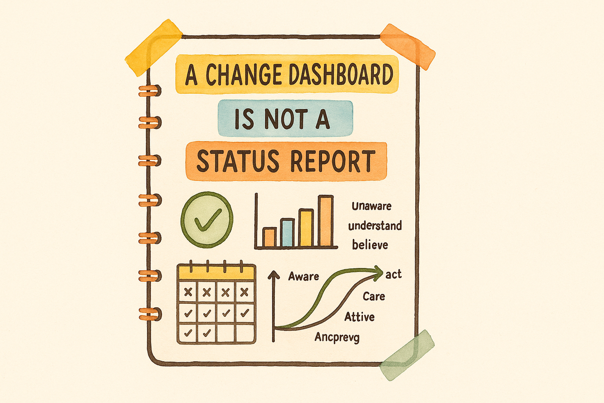
If your dashboard can’t show where your people sit on the spectrum of commitment—unaware → aware → understand → believe → care → act—for an organisation’s most critical transformations, it’s not a change dashboard. It’s a project vanity report, built to show activity, not progress.
A Change Dashboard Is Not a Status Report
An effective change dashboard isn’t a status update. It’s a strategic instrument.
It must translate the messy, human reality of change into actionable insights. It’s not about how many town halls you ran, it’s about whether people are actually adopting new behaviours or ways of working when the organisation needs them to.
One of the strongest predictors of change success is trust in leadership. Yet it rarely appears on dashboards because it’s hard to measure and even harder to present without making people uncomfortable. If you’re serious about change, you need to get serious about measuring the right things, even if those conversations feel prickly.
Why Boards Get It Wrong
Most consulting engagements involve change, yet Boards and Steering Groups often default to measuring activities rather than outcomes.
- Workshops run? Check.
- Emails sent? Check.
- Change successful? …Silence.
Boards rarely see behavioural adoption because Change Managers don’t describe it well—and boards don’t know how to ask for it.
The Danger of False Confidence
Be careful. Dashboards can create a false sense of control. Change is inherently uncertain. A dashboard can support decisions, but it’s not a crystal ball.
If your dashboard looks like a Gantt chart, you’ve already lost the plot. While useful, it does not tell them the “so-what” they need to know. And one step further is the recommended “Now-what”.
Executives don’t care how many communication packs you sent—they care whether their people are ready and willing to work in new ways.
A change dashboard without a commitment metric is like a fitness tracker that only counts how many times you open the fridge.
The Anatomy of a Real Change Dashboard
Here’s a framework for a change dashboard that cuts through noise and surfaces what really matters.


